“As a kid, I was fascinated by the magazine illustrations in National Geographic, Scientific American and others. I still collect them to this day,” says Ivan Gromicho, senior scientific illustrator with KAUST’s Research Communication team.
“I loved how the artists presented information and facts in such a beautiful and elegant way, and I was interested to follow in their footsteps. I grew up in an artistic household, with painters, sculptors and graphic designers in my immediate family.”
During his master’s degree, Gromicho specialized in the recreation of extinct creatures in their ecosystems. “I’m passionate about nature, animals and human anatomy. It’s exciting to represent details of our current world that we cannot usually see: biological realms, marine ecosystems, even the subsurface structures beneath our feet.”
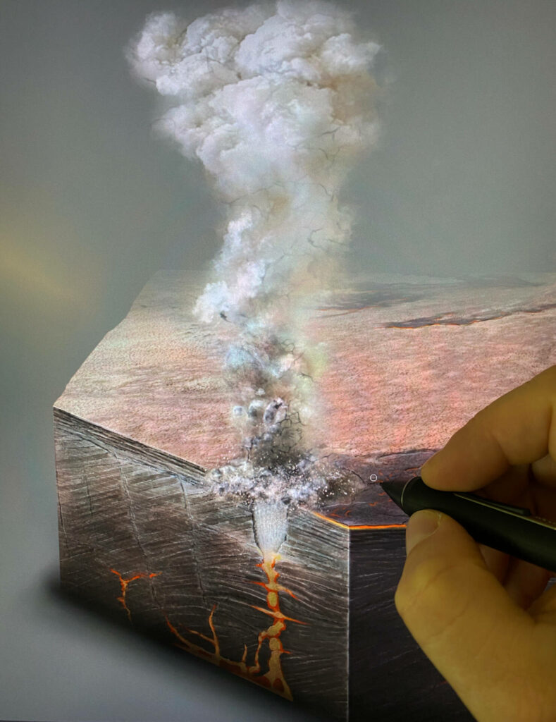
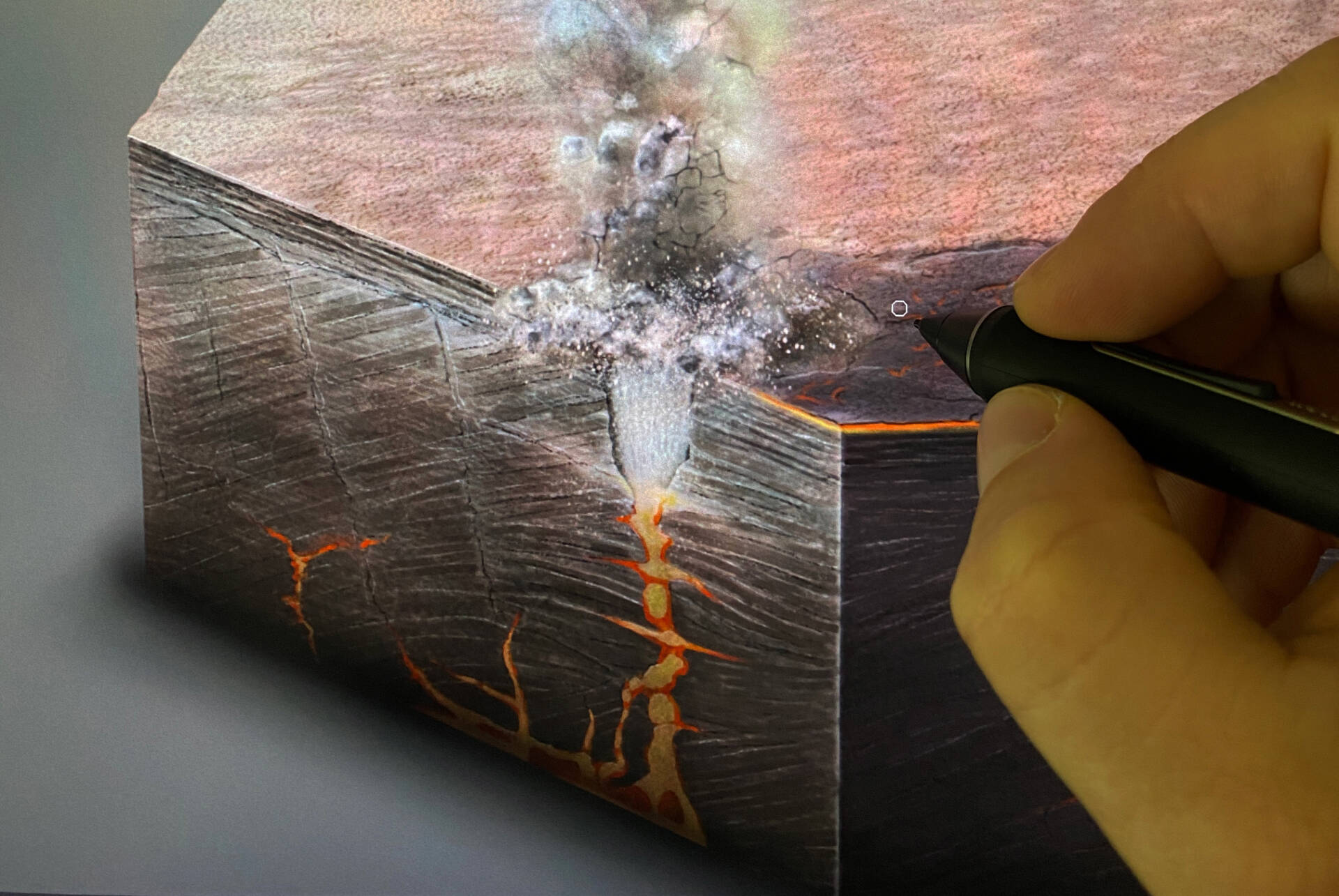
At initial meetings for the development of KAUST Insight, Gromicho suggested incorporating double-spread infographics that would highlight archaeological sites, medical innovations and the natural environments of Saudi Arabia to enrich readers’ knowledge of the country. One such example was the formation and geology of the Al Wahbah crater, northeast of Jeddah, which is one of the country’s most popular tourist destinations. At 2.2 kilometers across, it is the largest of the country’s many volcanic-related craters and has been estimated by KAUST researchers to be slightly more than 1 million years old.
“One of the hardest elements of representing geology through illustration is the scale – not just the scale of the surface and subsurface landforms, but also that of deep time,” says Gromicho. “Accurately capturing the sheer scale of the Al Wahbah crater was an interesting challenge.”

The infographic needed to satisfy both expert and nonexpert audiences. Every element had to be accurate, serve a purpose and be easy to understand.
The first step for Gromicho was to take a trip to the crater himself, where he hiked around the crater taking photographs to frame the landscape of the crater. Gromicho then used these photos as a reference for painting the landscape.

He chose to draw the first wide-angle view of the crater that people see when they arrive. “It’s an incredible sight, the crater opening up before you. I wanted that awe-inspiring image to be the first element of the design,” he says. “In a photograph, there is so much for the eye to take in – a sketch allows you to bring out certain details and fade out others. For example, you can pick out textures in particular rocks and add an animal or two for scale, but it’s difficult to persuade an eagle to fly past at the exact moment for a photograph!”
Gromicho used examples of the local flora, fauna and people to place the observer into that specific environment. However, the sketch formed the backdrop rather than the main scientific focus of the infographic. Gromicho used the color palette of the landscape and shades of red to represent the diagrams of lava and associated volcanoes. The eye is naturally drawn to red, so these elements stand out to grab the readers’ attention.
The infographic needed to show the location, shape and known formation details of the crater. For these elements, Gromicho worked closely with geologist Froukje van der Zwan and her research group at KAUST, who have been studying this and other volcanic structures across the region.
“Illustrations that require me to go outdoors and explore, gather ideas and get my hands dirty collecting materials are some of my favorite projects.”
Gromicho was grateful to receive artistic guidance on this project from National Geographic’s Senior Artist Fernando Baptista.
Click here to view the final infographic online.
To see more of Gromicho’s artwork, follow him in Instagram.

